
Ever lay out a banner or large format design on your computer, have it printed, then find out you can't read it from 100 feet away? What looks big to us indoors is often times lost in the vastness of the great outdoors. I recall doing a very large banner, I think it was 50 feet wide by 70 feet tall. It was just huge rolled up on the floor. When the crane lifted it and affixed it to the side of a 10 story building, it looked like a postage stamp. Here's some useful information if you are planning outdoor graphics and are not sure how big your letters need to be.
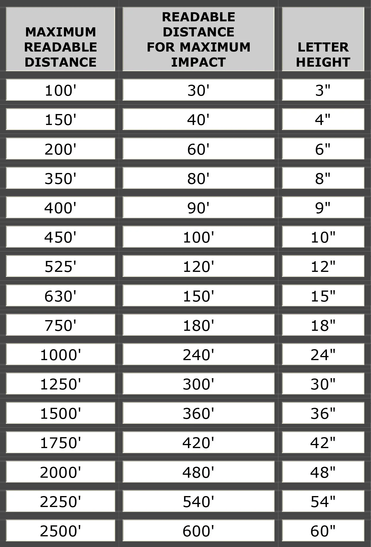
This Letter Sizing Chart is placed here for your convenience in helping you determine the size of letters based on the distance they are to be viewed. This is by no means an exact representation, there are many factors involved and this chart only represents the averages. The color of the lettering on different background colors, (see below) textures, letter styles, weather conditions, amount and quality of light, a person's eyesight and the speed at which you are driving past the signage can all impact the readability.
Larger letters doesn't always mean better legibility, the area around the letters or what is known as the 'white space' must be sufficient to allow the lettering to create a contrast with the background. Many people make the mistake of placing lettering too close to the edge of the sign background or crowding the 'usable' sign area on a building. Placing letters too close together in order to fit larger letters in a smaller space can drastically reduce the legibility of the sign.
Tall slim letters are usually less legible than shorter standard styles, so the 'height' of a letter is not the main concern when creating readable copy on your sign. Your professional sign artist can help you determine your needs.
An example from above: at the top of the chart shows that from as far away as 100' you can "read" a 3" tall letter, this does not mean that this is the best size choice for readability it only means that under the best situations you could read the letter. The center column shows that at 30' you get the best readability for a 3" letter. A rule of thumb is a distance of 10 feet for each inch in letter height, you can test this by typing in a few words in a computer program at different font styles, colors, sizes, and printing them out and posting them on a wall, then stand back and view them at different distances to see how all these variables come into play in choosing the proper lettering for your sign. Trying to save a few dollars by purchasing smaller letters is not a wise decision, neither is trying to use too large letters in too small a space, you may be wasting all your expense and efforts when the sign cannot be read by the customers you are trying to attract.
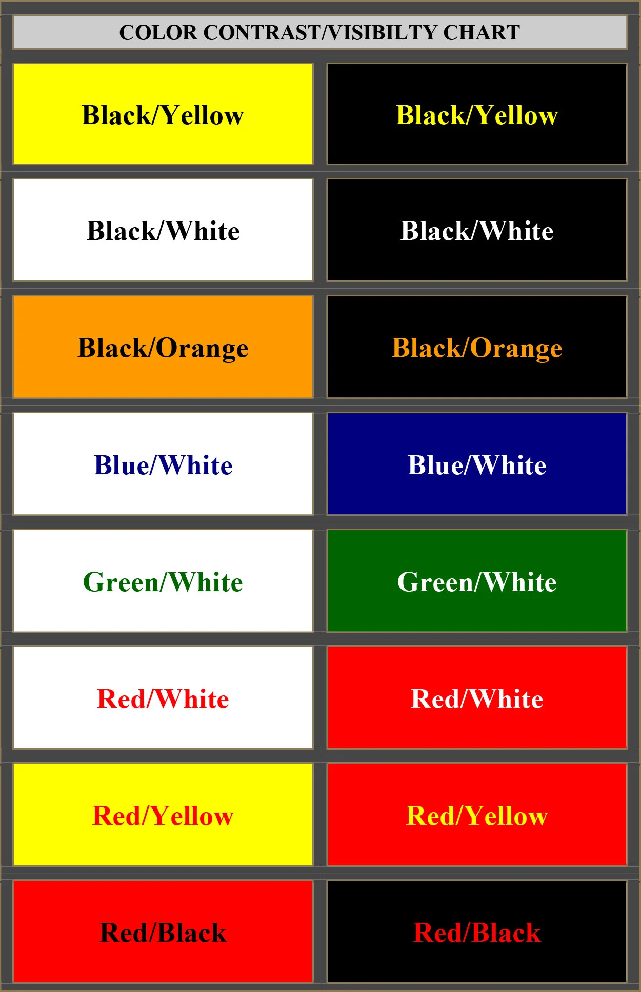
This Color Contrast/Visibility Chart will help you in determining the proper use of color combinations to achieve the greatest readability. Signage that MUST be read from longer distances require the use of more contrasting colors than for marketing materials that will be viewed up close. Billboards need more contrast than magazine ads, not only for letter size, shape and color but due to the fact that stationery advertisements are affected by the reader’s response time. You may only a have two or three seconds to view a billboard and safely watch the traffic, while the magazine ad can be studied at leisure and the less contrasting colors may appear more appealing for close viewing.
Your local graphics professional should be able to help you with creating the best color combinations for the type advertisement you need. Please keep in mind that not all graphic artists are trained in the best overall use of design for all different types of work, some may create stunning magazine ads but fail completely when trying to design a billboard and those specializing in web design may not make the best decisions for printed marketing materials.
There are many factors that should be considered for the type graphics you need for your project. If you are putting together a marketing campaign you would be smart to hire a graphics firm that has a broad range of services that can be coordinated into one project that covers all your needs. It is unwise to hire out each aspect of the project to several different companies; you will end up with too many variations that could render your project useless as a marketing tool.

The colors from top to bottom show the descending contrasts of colors in combination to each other. The top 6 rows are the better choices of colors for good contrast, the next three rows show less contrast and the last two rows would be very poor choices for readability. These last two rows although considered bright and vivid colors, their uses together should be limited to accents only. Many unknowing and untrained amateurs will try to use these at the customer’s request to create signage and end up with unprofessional and unreadable results. The eye cannot focus on Red/Blue or Red/Green when the colors touch and that is what makes them appear to "sizzle" when used together. When using these last two color combinations, the introduction of white or a very light yellow must be used as a transition to create contrast and avoid the sizzle effect as shown below.

Colors on computer monitors never match real world printed colors due to the fact that it is two different technologies that create the colors you see. Computer screens are made up of phosphorous coatings on a Cathode Ray Tube (CRT) and lit by an electron beam or from Liquid Crystal Diodes (LCD) being turned on or off by electrical charges, either way these are called transmissive colorization because the colors are beamed from the monitor to your eyes. Whether in a brightly lit room or a totally dark room you can still see the colors on the monitor, whereas with printed colors they appear best in a well lit room but cannot be seen in the dark as there is no light to "reflect" them to your eyes. Printed colors are made up of inks or paints printed onto surfaces that reflect the colors from the page to your eyes. Transmissive colors appear more vivid on screen than the same "true" colors do on paper, color calibration of monitors is vital in getting a close approximation but there is NO WAY the two technologies can provide exact color matches across their spectrum. Do not use your computer monitor to accurately choose colors for your marketing materials always use actual ink or paint color swatches available through sources such as Pantone.
For more information on color and the theories of its use in various projects, just Google "the use of color."